What’s the difference between beige and taupe? What’s the difference between a warm and cool neutral? Since when is there a color called ‘greige’? What neutral paint colors make the best bedroom colors? What does neutral actually mean? Neutral isn’t as simple as grey, brown and beige; it’s every shade in-between.
Choosing the right paint color is difficult from the get-go and with more and more colors available to you, it can certainly seem like an impossible task.
To help you find your way, we’re going to take you through everything you need to know to choose the right neutral paint color for your home. Whether you’re painting your hallway, kitchen, bedroom, or even the outside of your house, we turned to Décor Aid interior designers for cues to help you get to know your Balboa Mist from your Carlisle Cream.
WHAT DO YOU WANT FROM YOUR NEUTRAL?
Neutral paint colors aren’t boring, in fact neutrals can be exciting. There are lots of reasons you might choose a neutral home paint; you might be after a relaxing atmosphere, you might want to make a statement or help something stand out. That being said, choosing the best color for bedroom walls (or whichever room you are painting) can be tricky, deciding what you want your neutral home paint to do for your room, is a good place to start.
If you want to make your room feel light, airy, and spacious, go for one of the lightest colors you can find. Remember, white doesn’t just mean bright decorators white; there are whites with all the subtle undertones you can imagine. If you’re looking for a more luxurious feel, go for something much darker.
There are some beautiful dark neutral paint colors which will give your room a much more intimate feel – don’t forget that dark colors can overpower a room (particularly if it’s a small room) so make sure you have something to break up dark home paint colors.
KNOW YOUR UNDERTONES
An undertone is essentially a ‘tinge’, it’s a background color which makes a surprisingly big difference. You might have heard of a color being referred to as ‘cool’ or ‘warm’; this is all to do with the undertone. Cool neutral paint colors would have a traditionally cool color as the undertone – think blues, grays and greens.
A warm neutral would have a warm color as an undertone – think browns, reds, and yellows. If you were mixing paint and you had the same grey, then add orange to some of the paint and green to the rest, you’d see how dramatically different the colors would be. Undertones aren’t always obvious, but once you start recognizing the difference between the paint colors you have in front of you, they’ll start to stand out to you.
To figure out the undertone color in your paint, take a look at the paint swatch. Looking at the darkest shade, gives you the best idea of the undertone in your paint. Once you’ve found an undertone you like, choosing the right neutral paint colors will be much easier. You can look through your color swatches and those with the right undertone will jump right out at you.
COMPLIMENTING UNDERTONES
You may find that the neutral paint colors you thought would go perfectly with the rest of your décor, just don’t. Usually, this is because the undertone isn’t correct. If the undertone color doesn’t go with your art, your soft furnishings or your furniture, there is no way it is going to look good in your room.
Finding undertones which complement the rest of your interior is a sure-fire way to choose the right home paint colors. Comparing the undertone color of your paint with the items in your room will help you determine whether the paint will look good on your wall.
A home paint with a blue undertone might not sit well with luxurious dark brown leather sofas, just like a home paint with a red undertone might not sit well paired with a bright blue rug in a playroom. To find the best paint colors for bedrooms, make sure the undertone of your paint goes well with your bed linens, furnishings, and flooring.
COMPARE YOUR CHOICES
Once you’ve narrowed down your preferred paints, it’s time to compare them. Let’s say you are redecorating your master bedroom and you’ve got six possible master bedroom paint colors, consider the pro’s and con’s of each. Not only do you need to compare the different paint colors with each other, you need to consider how they feel around your room.
Home paint colors can look completely different in the light, in the shade, next to furniture, by flooring and alongside architectural features in your room. A paint color you love next to the window, might look completely different to you when it’s in the shade of a cabinet. Ensuring you like the paint color you’ve chosen everywhere in the room is very important – as it saves a lot of time and money on repainting when you change your mind or need an update. A pro tip is to avoid painting samples on walls – they make a mess of your room.
Paint samples onto paper, then you can use making tape to stick them to the wall. If you paint straight onto the wall you can end up with your room looking pretty unsightly, and if you do it too thickly, it will still be visible when you paint over it. Painting neutral paint colors onto paper also enables you to move the samples around your home with ease.
LOOKING TO SELL YOUR HOME?
It should come as no surprise that a fresh coat of paint can help when it comes to selling your home. Neutrals are a ‘go to’ when you’re looking to entice a buyer. There are a few reasons for this; the lighter, brighter colors cheer up your home and make the rooms feel more spacious while unobtrusive, neutral palettes allow potential buyers to envisage the rooms containing their belongings – a blank canvas, if you will.
Neutral paint colors also work for the outside of your home as well as some of the best exterior house paint colors are neutrals, and they look amazing. However, ‘how to choose exterior paint colors for your house’ is a whole other conversation, but you get what we’re saying?
Now you know your Carlisle Cream from your Balboa Mist and the case behind the power of neutral paint colors, it’s time to get started on choosing perfect paint colors for your house.
We love the crispness and simplicity of a well-curated neutral palette. From the kitchen, to the bathroom, to the bedroom, it’s a great way to create a stylistic cohesiveness throughout the home. But if done incorrectly, a neutral palette can feel cold, or even boring. If you’re looking to keep things interesting, follow our guide to designing with a neutral palette.
TEXTURED MATERIALS
When sourcing materials for a neutral palette, it’s important to consider the texture of your materials. Instead of going for a solid all-white look, go for something with more contrast. Natural materials are a great way to do this.
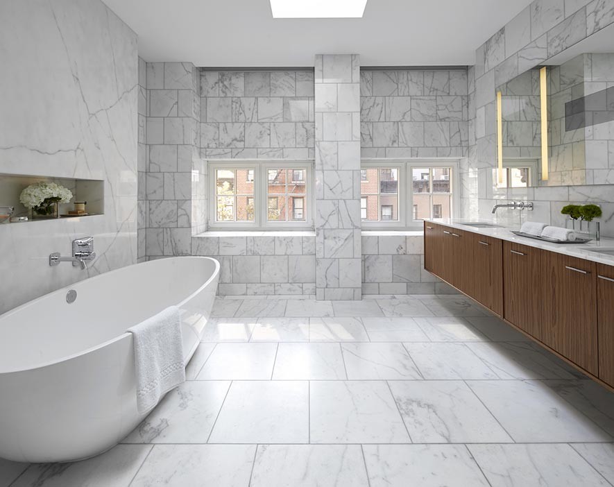
Check out the contrast between the wood cabinets and the floor-to-ceding marble in this Manhattan Brownstone that we redesigned.
PATTERNS
Just because you’re designing with a neutral color scheme doesn’t mean that you have to only pick solid patterns. Look for a tasteful geometric pattern that riffs on a color that you already have in mind.
If you’re looking for inspiration, check out the patterned area rug that we incorporated into this Westchester home.
HIGH-CONTRAST COLORS
A neutral palette should never be bland. Offsetting darker greys and blacks against bright whites is one of the easiest ways to create a dramatic, high-contrast neutral palette.
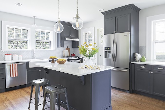
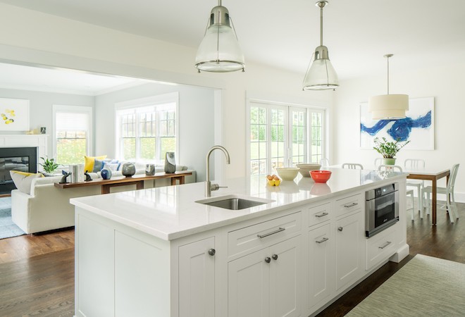
Check out the high contrast color scheme we implemented into the kitchen of this South Orange, New Jersey home.
MUTED NEUTRALS
Designing with bright colors is certainly more fun than picking between black and white. But incorporating too much of a bright color can easily disrupt your design scheme. If you want to incorporate brighter colors into your neutral palette, pick muted versions of your personal favorites.
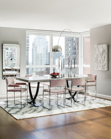
Check out the muted pink chairs that we had reupholstered for this luxury condominium on the Upper East Side.
POPS OF PRIMARY COLORS
If swaths of muted neutrals aren’t your thing, try incorporating pops of primary colors. Whereas brighter muted colors work well in clustered chunks, primary colors function best when peppered evenly throughout the home.
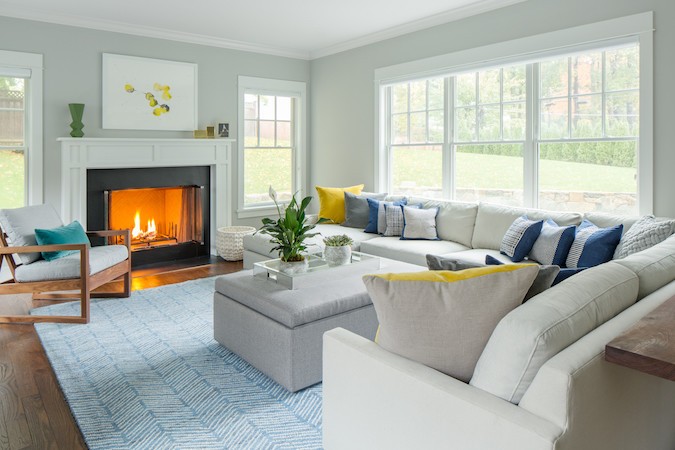
Check out the primary accents that flow through the living room, kitchen, and breakfast nook of this Westchester family home redesign.
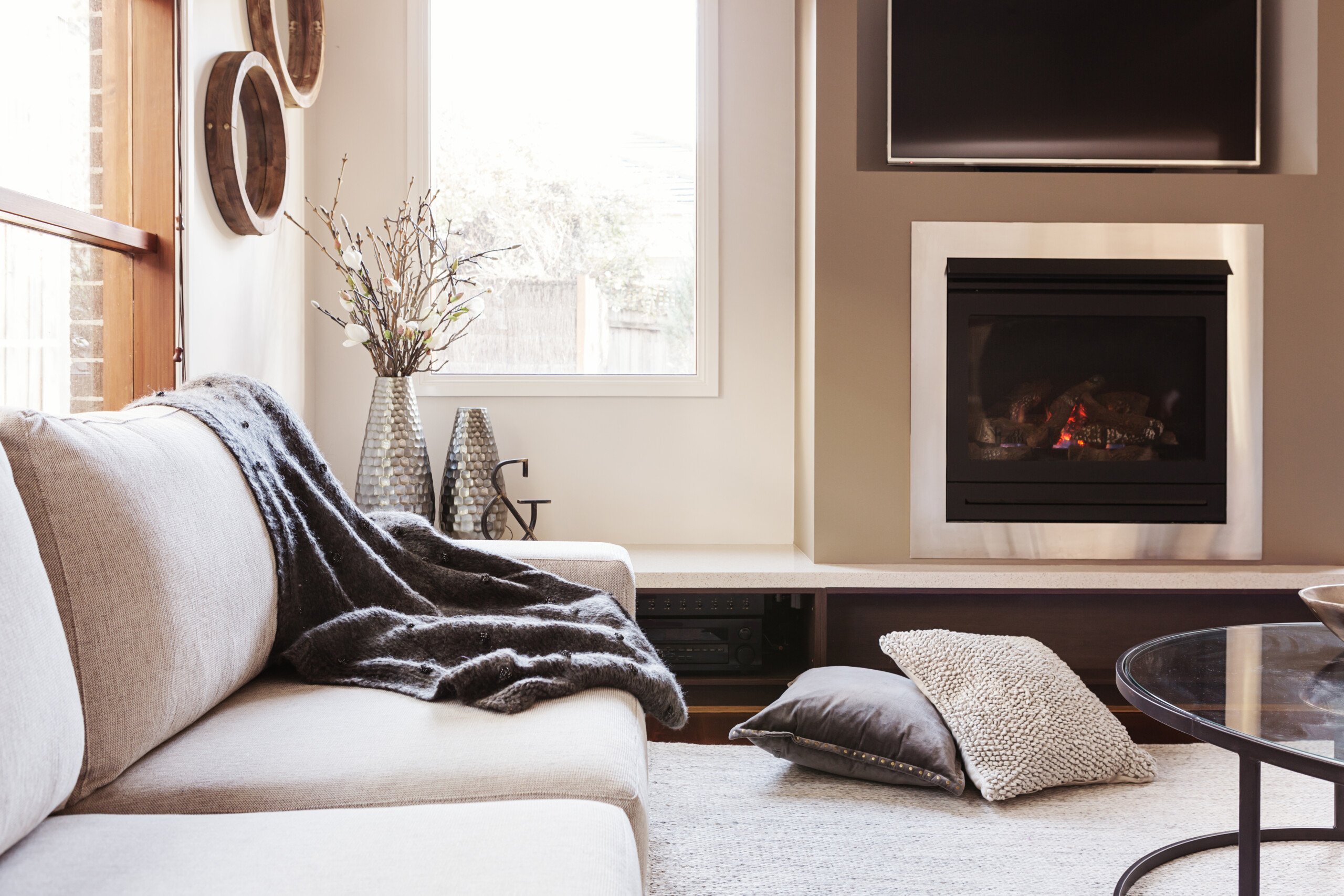
NATURAL ELEMENTS
Natural elements are a great way to keep a neutral scheme from feeling bland. Plants are an obvious way to add a bit of greenery to the home, but don’t forget to incorporate other natural elements, such as branches and geometric table objects.
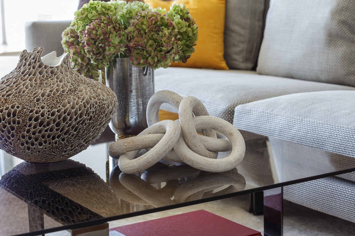
Check out the living room table that we styled in this luxury condo on San Francisco’s Market Street.
ARTWORK
One of the advantages to designing with a neutral palette is that you can incorporate a wider array of artwork into your design scheme. We find abstract paintings with bold colors, or black and white photographs particularly appealing.
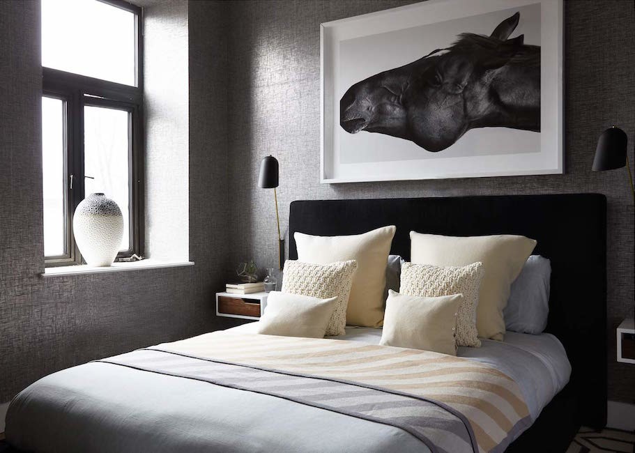
Check out the horse photograph that is framed above the bed in this SoHo duplex that we redesigned.
SHAPE
One of the easiest ways to add needed contrast to a neutral palette is to incorporate objects that vary in shape and size.