Just like you do with your closet and pantry, once a new season hits, its time to consider refreshing spring updates for your home that will better your everyday life. And since nothing beats a fresh coat of paint in an unforgettable hue, we’re looking at the best paint trends of the season according to Décor Aid interior designers.
Pastels and rich, warm shades are gracing us with their presence once again when it comes paint trends for spring/summer 2019, along with some other interesting shades that you might not have excepted to see. And since painting always sounds so much more romantic before you complete your first brushstroke, we’re looking at over 20 of the best paint trends that’ll be worth your time and investment for years to come.
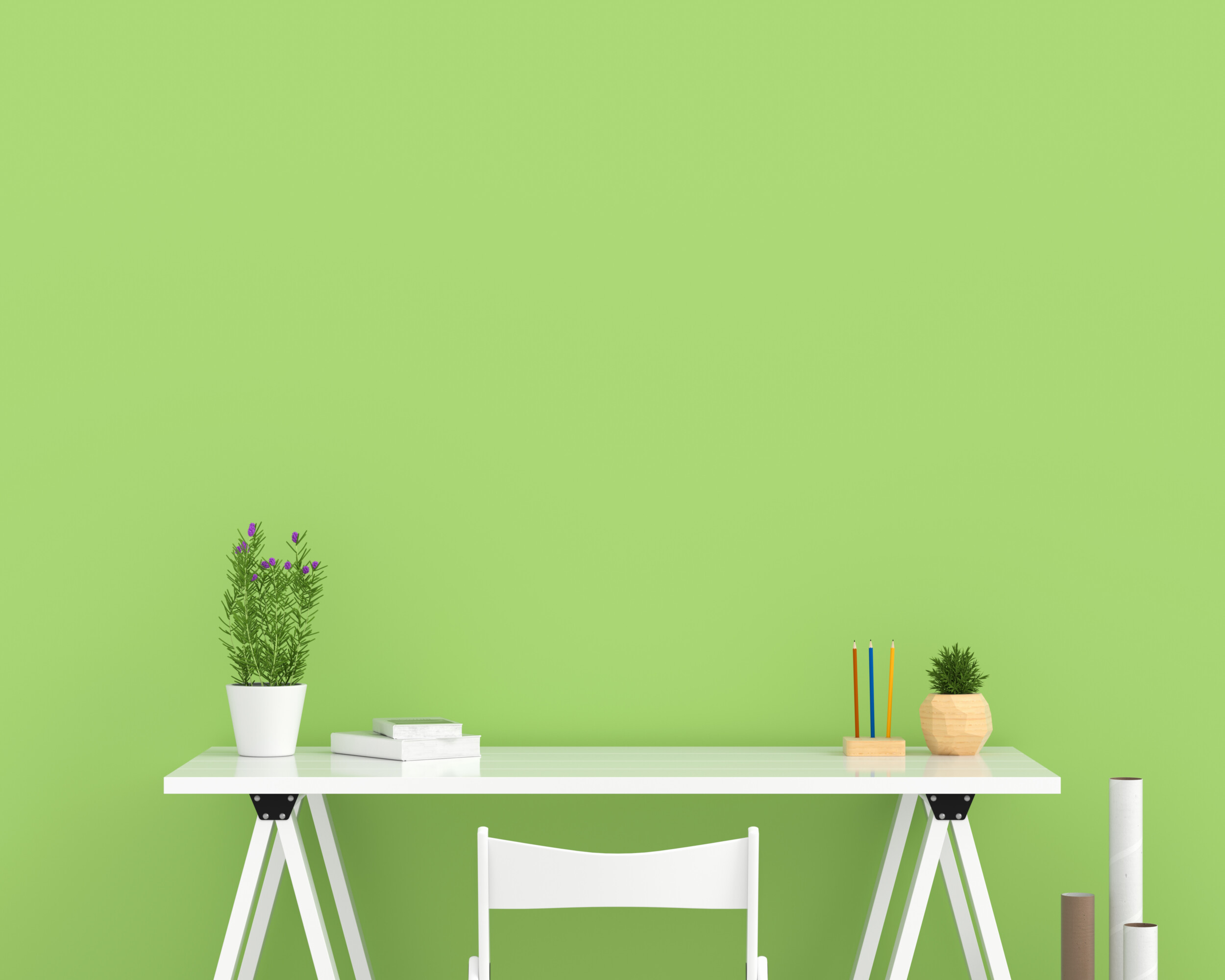
Seafoam
Perfect for Mid-Century Modern and minimal homes alike, seafoam green is refreshingly timeless with just the right amount of play to make it all the more irresistible. And since its a classic color, it will never go out of style.
Black
One of the more surprising paint trends for 2019, an all black wall boasts something instinctively cool and moody about it, though it can be hard to work with. But if it does feel right for your home, do make sure any room it goes in is ultra-bright.
Azure Blue
Take a cue from the idyllic beaches of the south of France and opt for this classic nautical favorite for a sense of strength and character in just about any room.
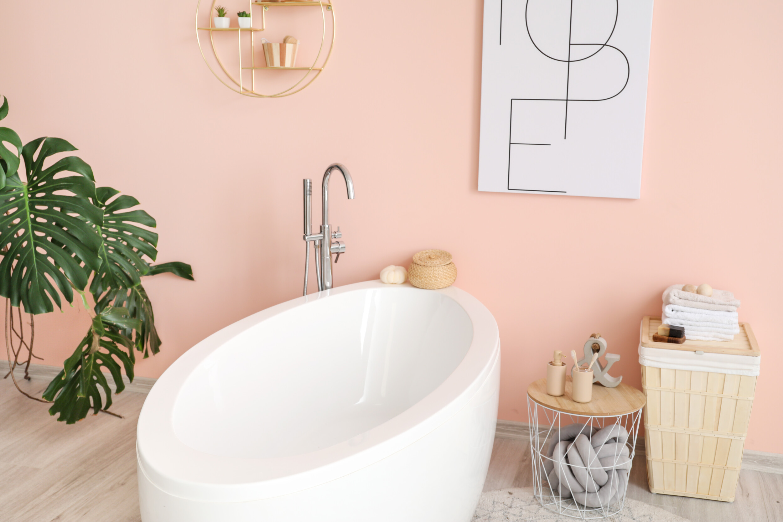
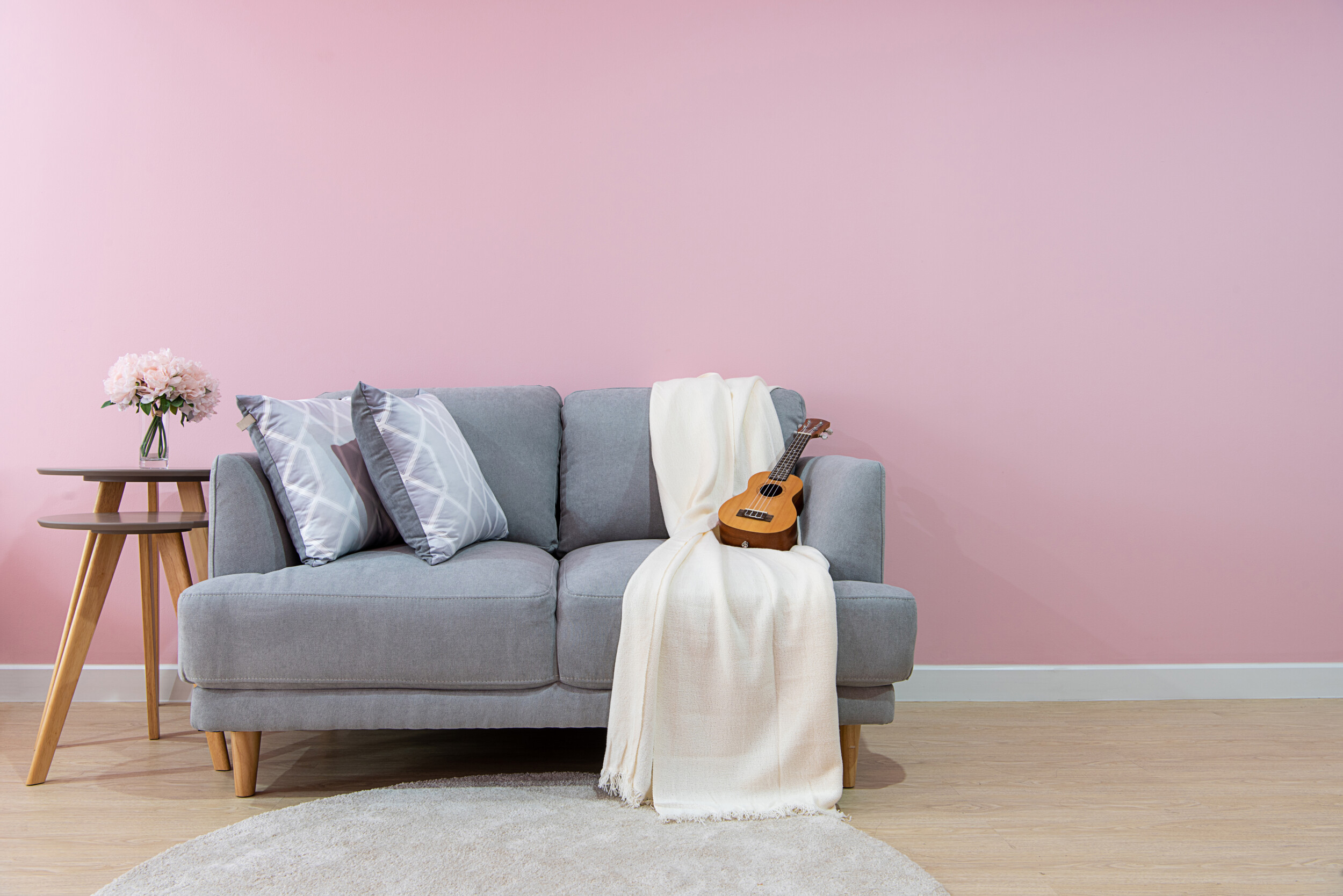
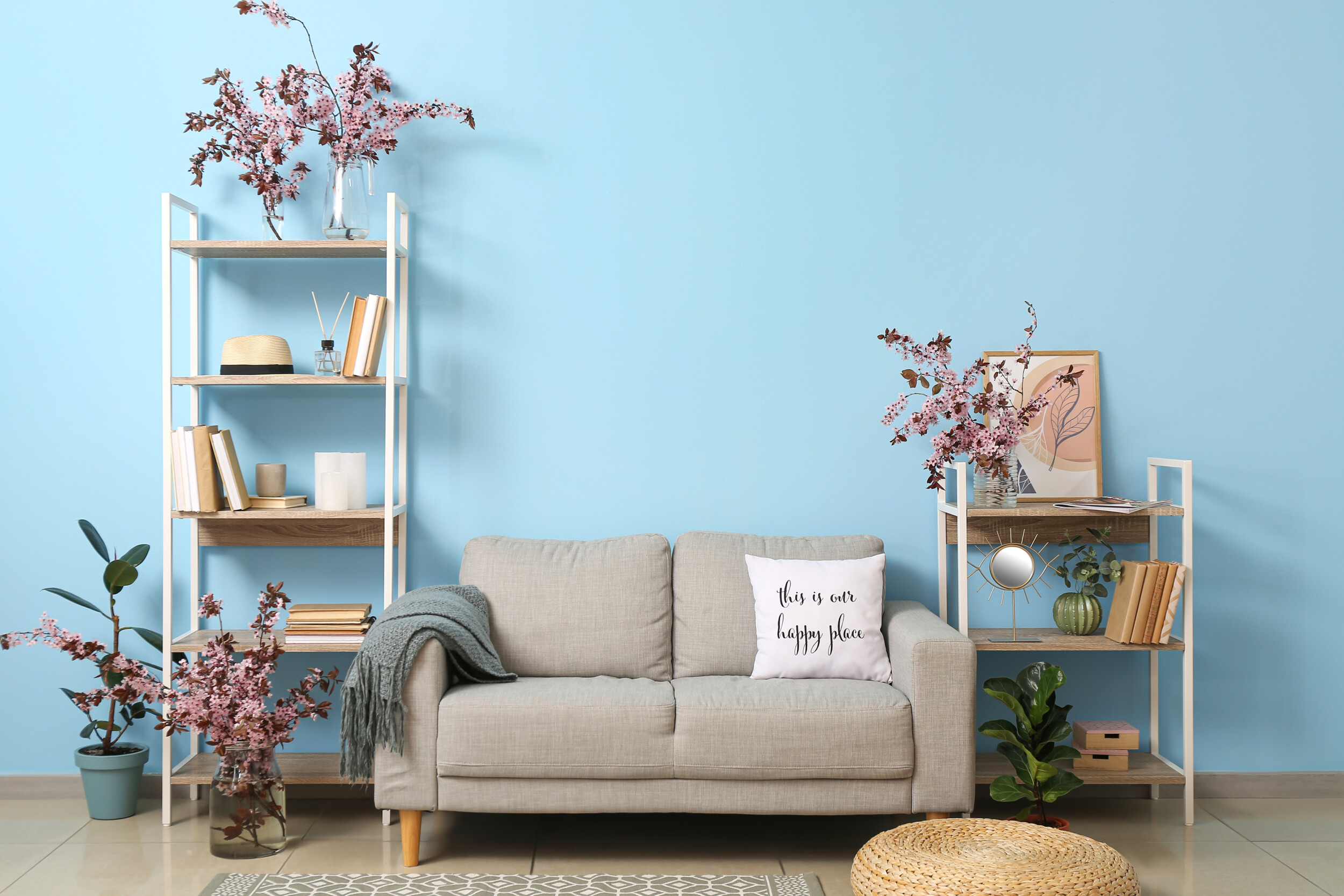
Faded Pink
Channel the season’s sun-drenched feel with a faded, watery pink that make any room feel warmer and comforting without feeling heavy-handed.
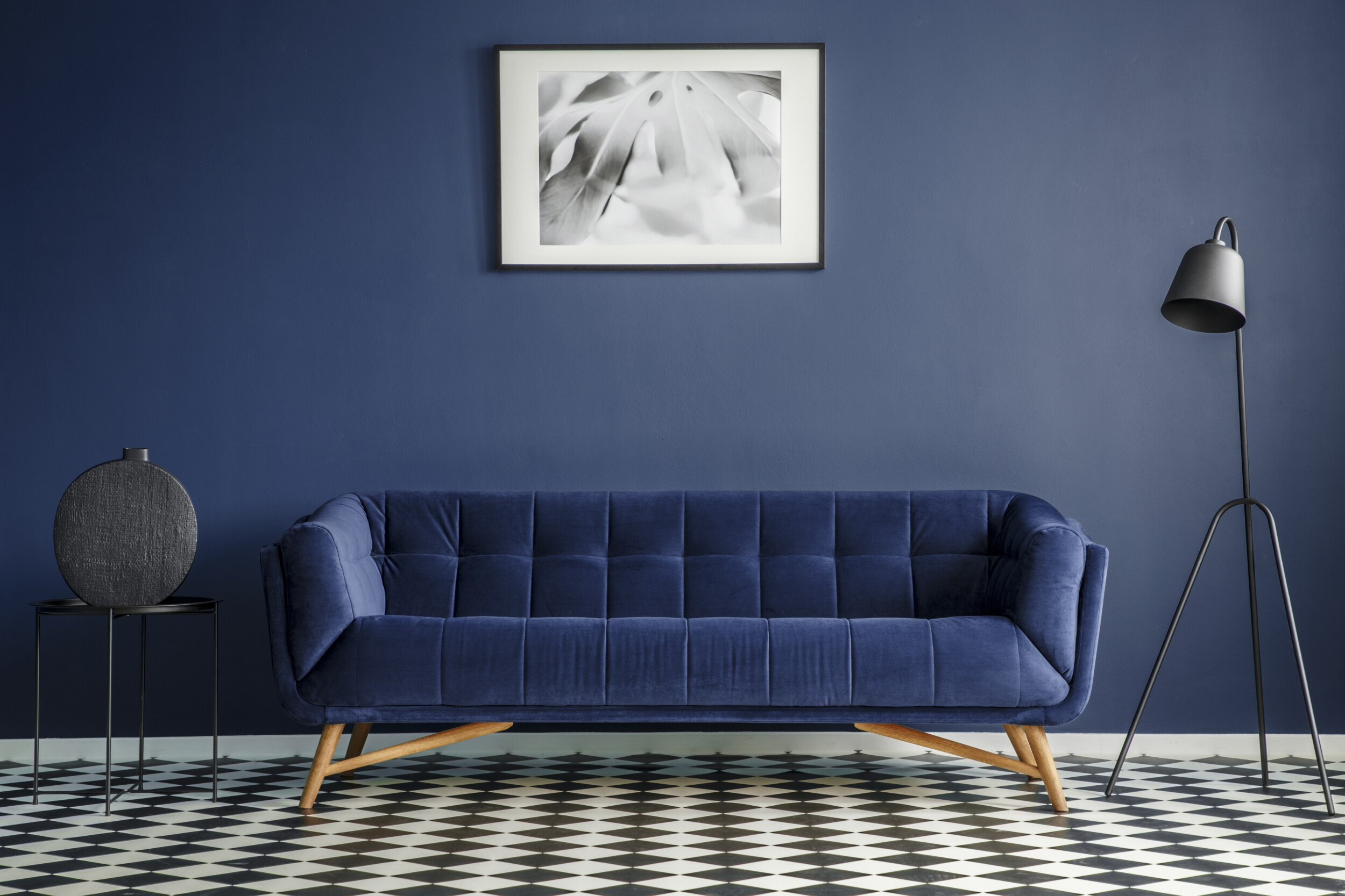
Deep Blue
One of the more intoxicating paint trends of the moment, a high-gloss deep blue is certain to elevate the mood of any space with a seriously decadent bent, though it’s not for everyone or even every home.
Before going for an extra-large room finished with a deep blue, start in small doses like a powder room or for an accent wall. And do keep in mind that it will highlight any and all architectural flaws and blemishes so you should ensure that your walls are as smooth as possible before you begin painting.
Matte Khaki
Great when paired with lighter tone and darker ones alike, a matte khaki is a great foundational color for a room, but if it’s too strong of a starting point for you, it will also make for a chic accent wall color to consider while adding more depth to a room.
Plus, it’s great for high-traffic areas that get a lot of daily wear and tear since it can conceal everyday stains with ease so you won’t have to end up covering or cleaning the same spots over and over again.
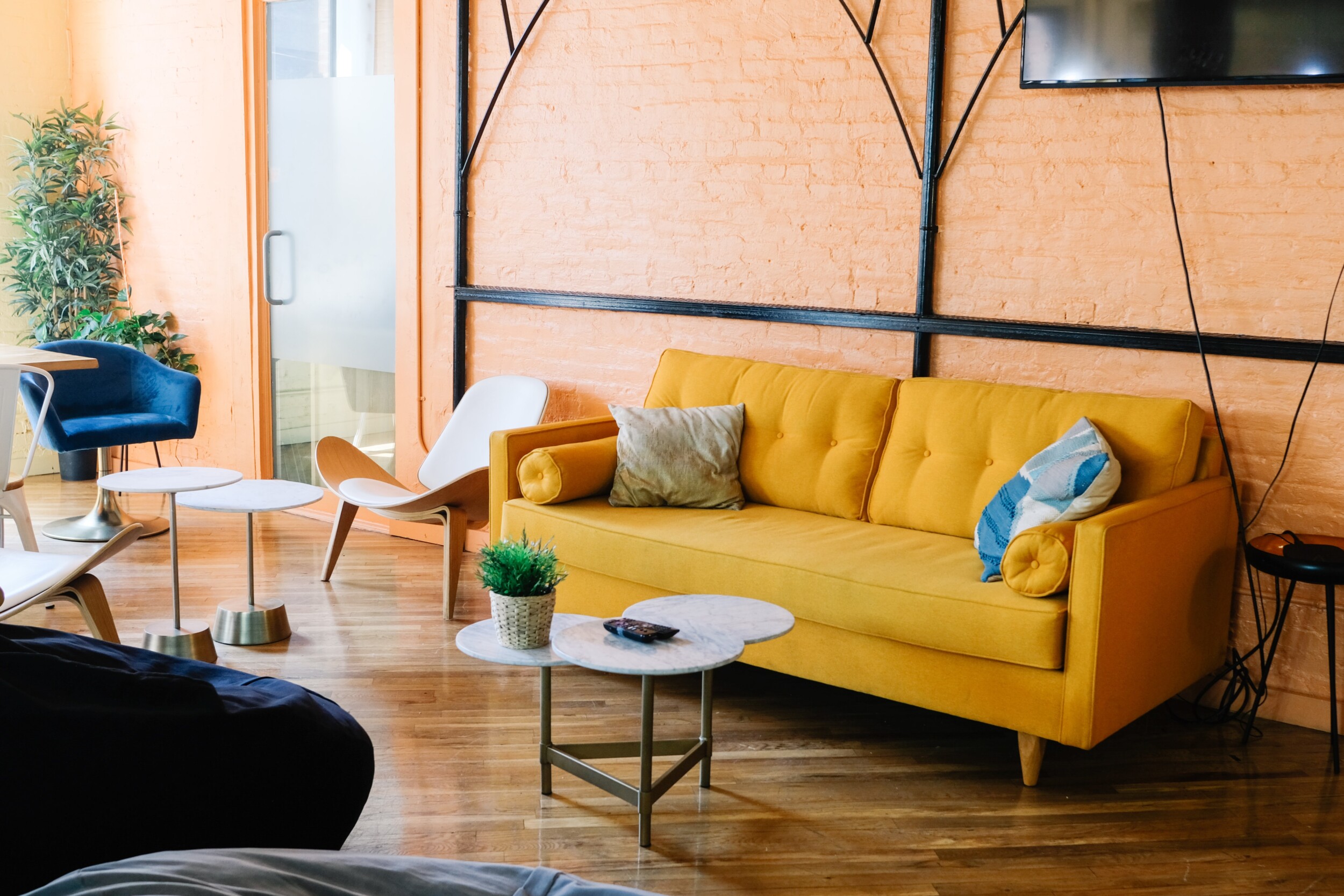
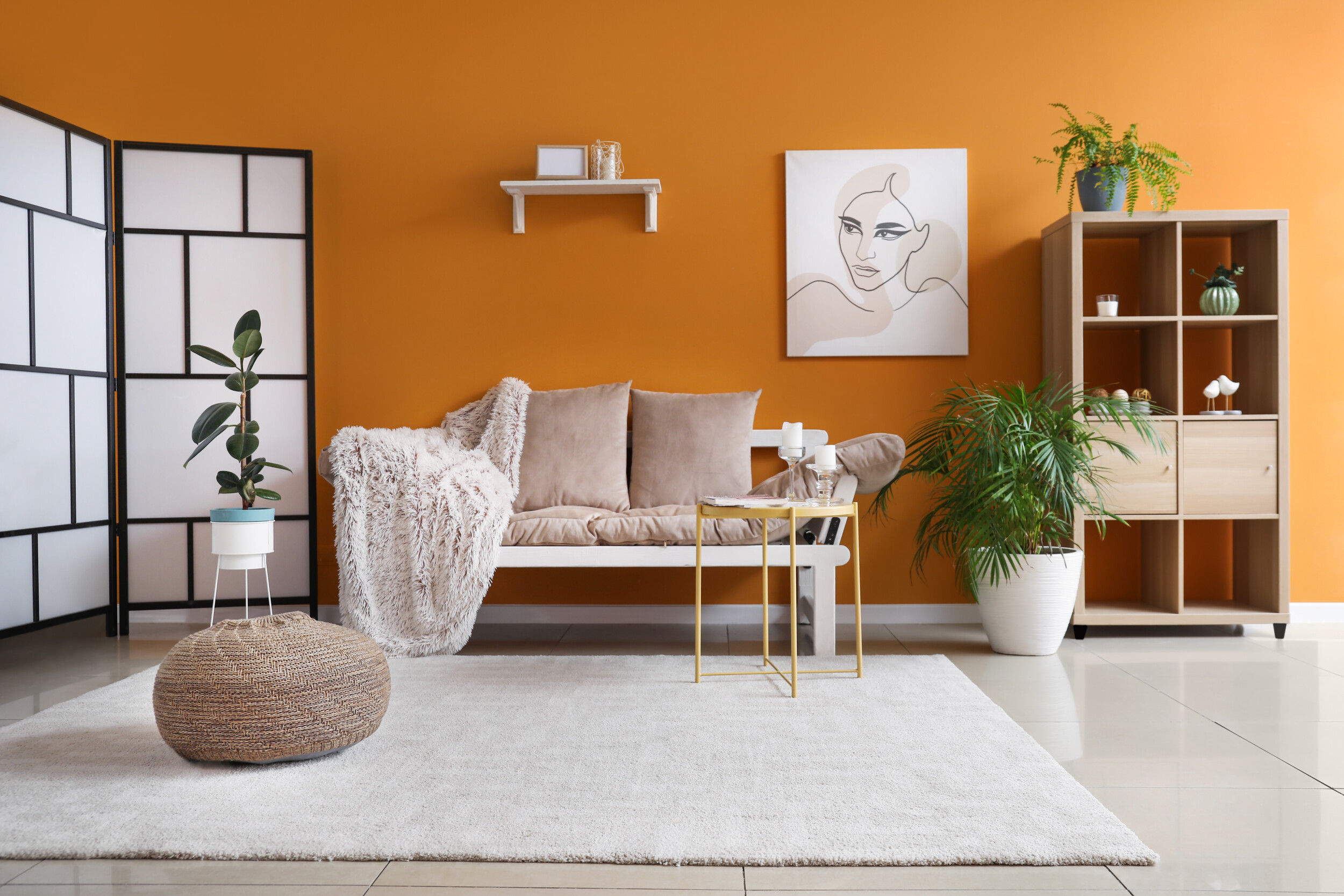
Mango & Sherbet
Bright and vibrant orange-yellow shades allow your mind to conjure up the vibrant flesh of a mango. This color has so much depth to it and it works well with the deeper colors on this list.
It’s not a color you would immediately think of as being summery when you first look at it since its somewhat moody, but when paired with some of the lighter trending paint shades, you will soon see why it’s topped many a list considering the best paint trends for spring/summer 2019.
Princess Rose
Less soothing than a powdery blush pink, a proper princess-inspired pink is one of the more timeless spring and summer paint trends. It’s romantic, nostalgic, and fun.
And its more in the direction of sweet, comforting pastels. It’s incredibly feminine and slightly saccharine, meaning you can dress, accessorize, and adorn your room to suit your needs and tastes without hindrance. You can style it so it punctuates a room or keep it muted with well-judged accents here and there.
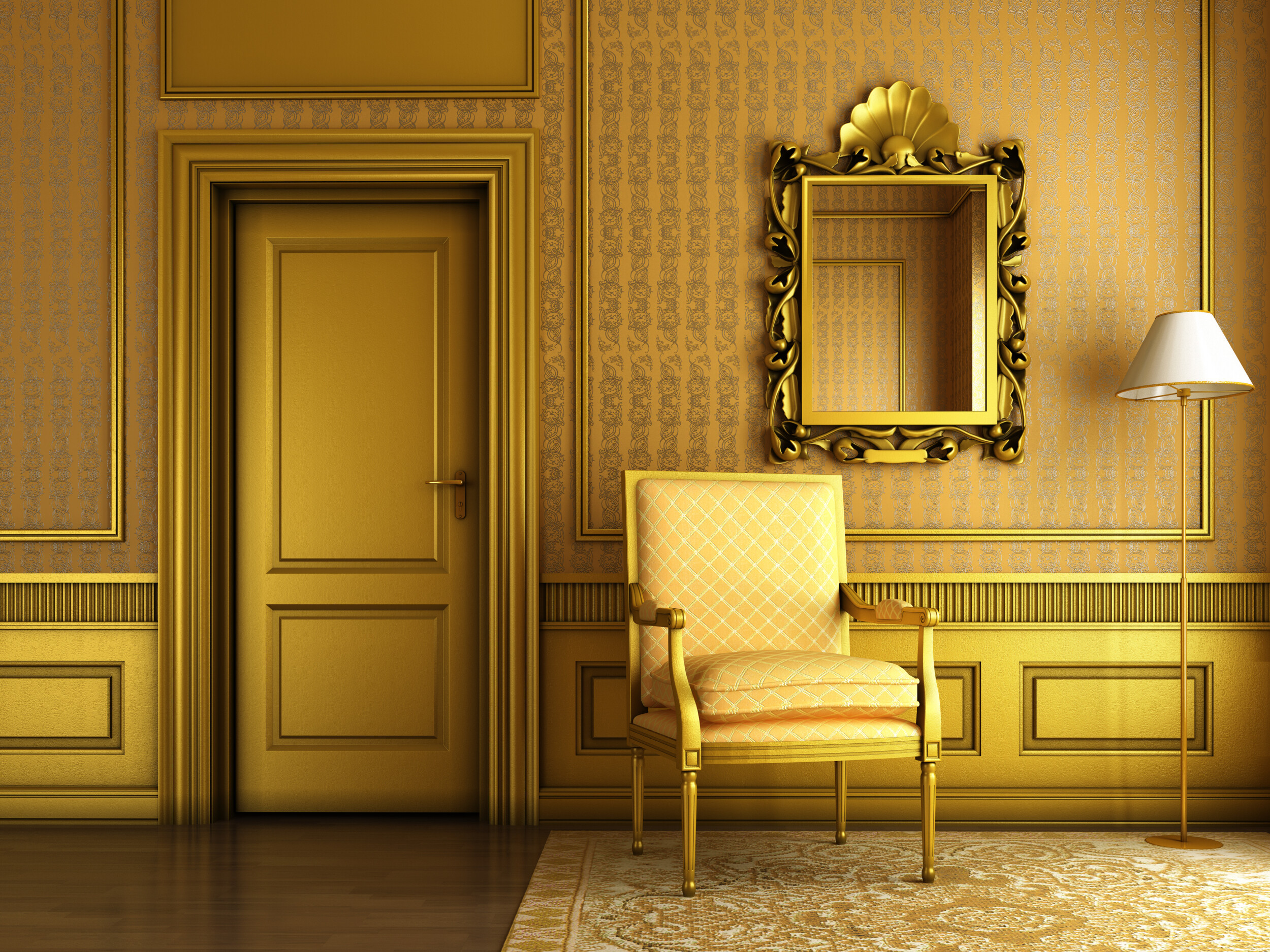
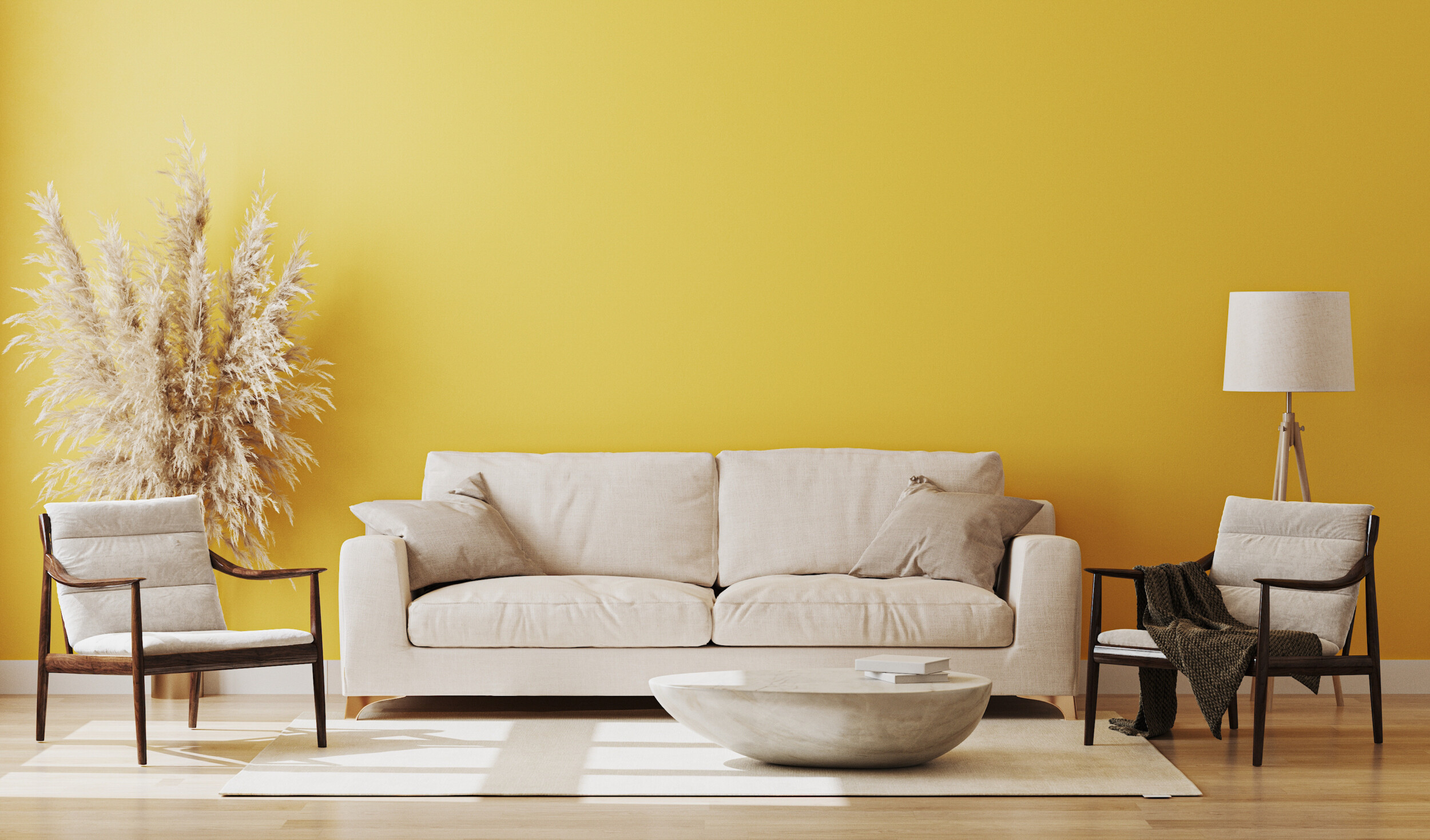
Golden Yellow
We’d feel like we were missing out if we didn’t see a deeper shade of yellow on this paint trend list, so we couldn’t help but provide you with an inspiring alternative. Golden yellow has a firm place in paint trends for spring/summer 2019 thanks to its sense of strength.
It’s about as sunny a color as you can get, but it has a different level of depth than your usual yellow that makes it easier to decorate with and more seasonless. A hint of orange runs through it, making it a seriously high-impact color while making it more foundational than as an accessory.
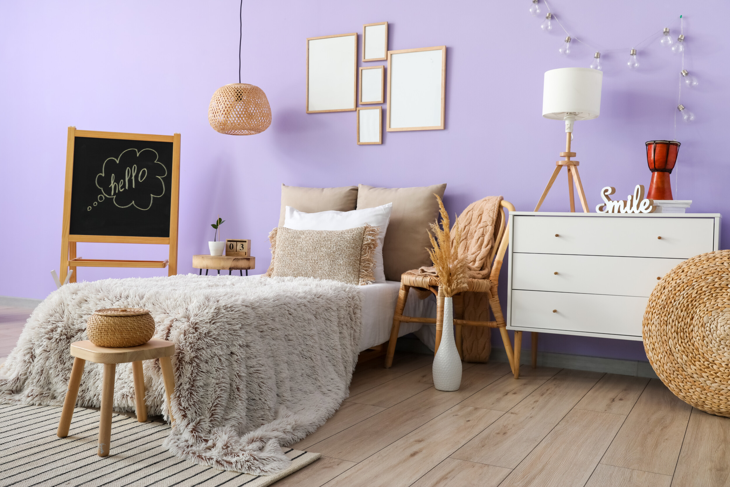
Lovely Lavender
As we said, pastel theme paint trends for spring/summer 2019 have been heavily trending as of late. Lavender is a cooler shade than the pinks we mentioned before, making it a great color for feminine and masculine spaces alike.
It looks wonderful along grays, deep neutrals, and metallics, allowing you to bring brightness and earthiness to your space at the same time. But for an elevated and unforgettable effect, our interior designers suggest using a deeper more intense tone in a small area like an entryway or powder room for extra impact.
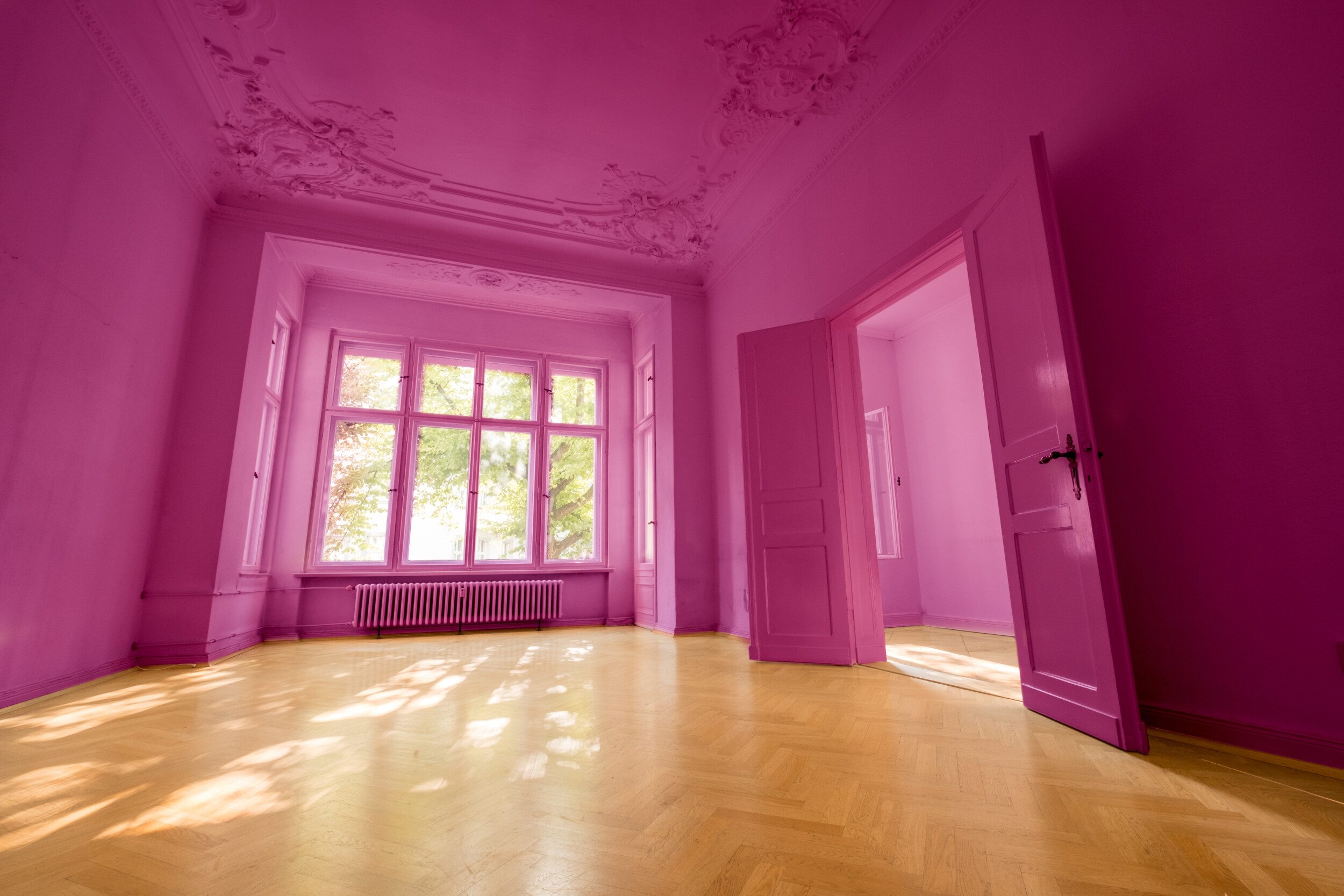
Forward Fuchsia
Fuchsia is a fiery and bold color, taking charge of a space and owning it. With this magenta-like shade, summer paint trends are being brought into check, as the vibrancy of it leaves it nowhere to hide.
This is a perfect paint color for summer as it brings brightness and boldness into your home. It also looks great teamed with other stand-out colors like orange and vivid blues and greens.
Tangy Turmeric
This spicy shade will be sure to revitalize your home décor and our interior designers can’t get enough of it when it comes to paint trends for summer and spring 2019. It’s vibrant and it’s unexpected, and it also has great depth to it as well.
It looks amazing paired with metallics, greens, and tan neutrals, as well as deeper browns, reds, and even azure blue. And while it is perfect for summer, it has almost an autumnal feel to it, which makes it great for year-round use.
Soft Yellow
Yellow is the undisputed color of spring – we are used to seeing vibrant shades of yellow all around us throughout the warmer months and this year is no exception (apart from the fact that its a much lighter shade).
The palest of yellows makes for the best spring paint trends when paired with other pastel shades for a seriously vibrant feel. But you can also go much lighter for a watery, more Victorian era feel that’ll lend a faded, timeworn sense of beauty to a room.
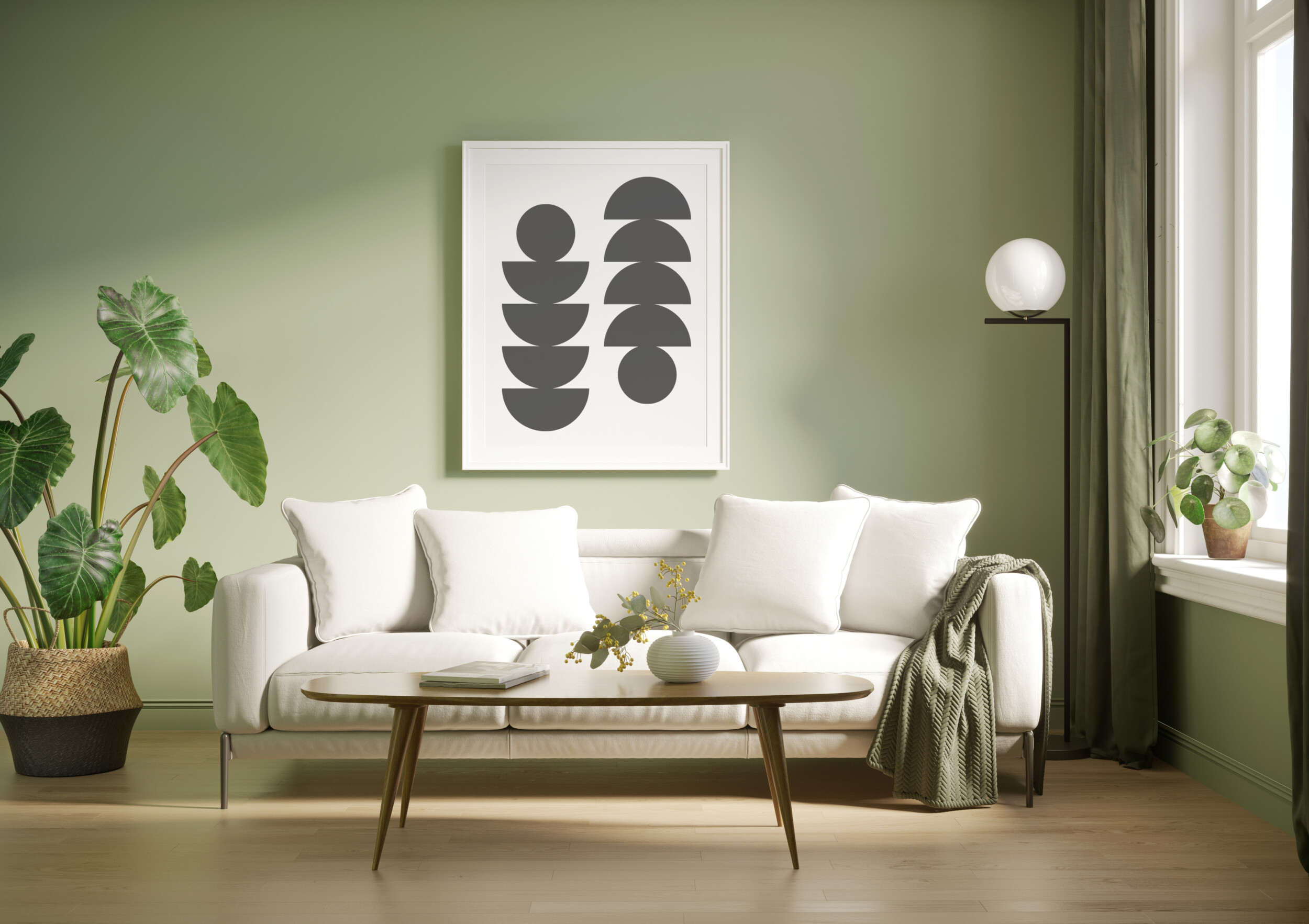
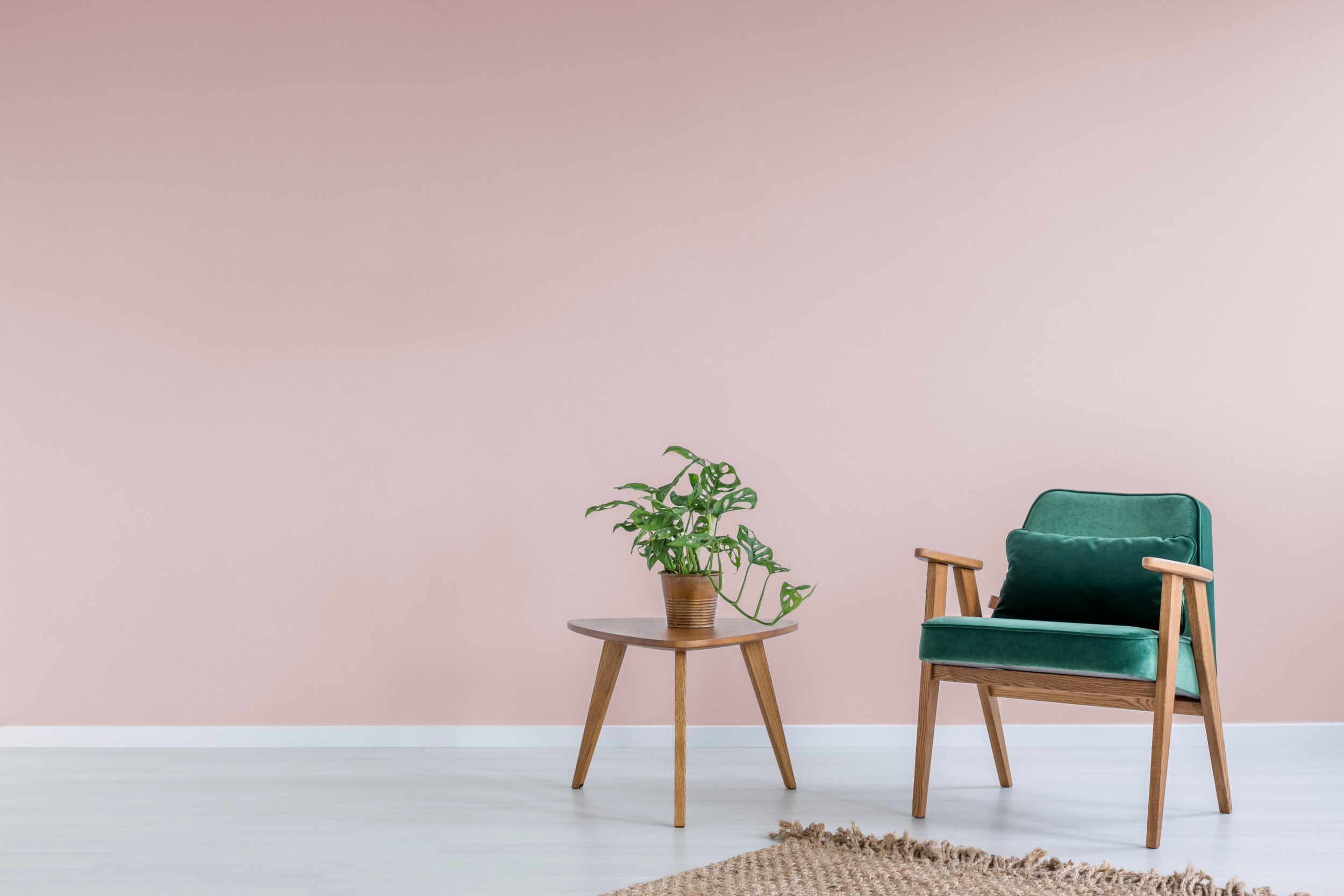
Mossy Green
A mossy green is another one of those incredibly flexible colors. Its a great color for your home all year round and its no wonder that it’s been featuring heavily in paint trends for spring and summer this year.
It works wonderfully with deeper, darker shades of black and brown, as well as lighter and softer neutrals for a more minimal and quiet feel. Not only that, but it also works wonderfully alongside florals and pastel shades, making it one the more versatile spring paint trends in the bunch as you can take it anywhere that’ll suit your home.
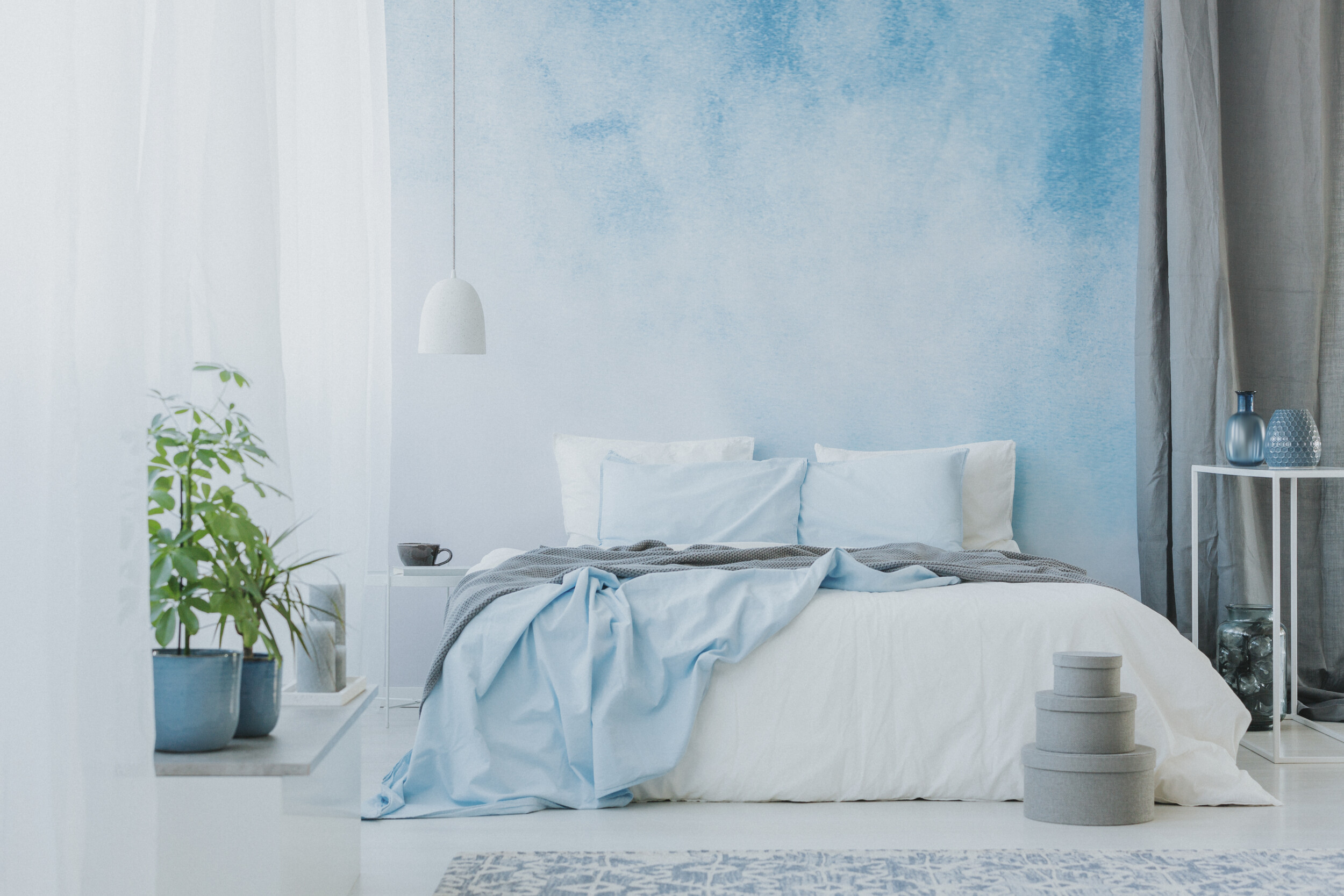
Soothing Blue
Soothing watery blues are another pastel to add to your list of paint trends for summer 2019 as you have to admit, it’s an incredibly pretty and timeless color. Again, its one of those colors that can be used in masculine and feminine spaces alike with relative ease it all depends on what you team it with.
It looks stunning against bright white as well as light and dark natural wood and even stainless steel. This soft shade of blue is the epitome of paint trends for spring 2019 simply because it will help you channel the spirit of the season and it will brighten up gray days come fall/winter.
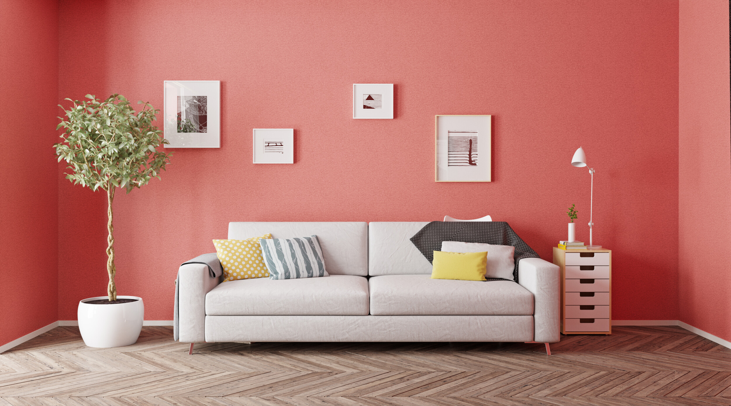
Vibrant Coral
With living coral being Pantone’s color of the year, it should come as no surprise to see the hue on any paint trends list for 2019. Coral is a great color for brightening your space, adding a touch of play to the paint trends for spring/summer this year.
Coral is also a great route when looking to add energy to a room and it boasts a timeless feel since it pairs well with just about anything and any kind of design style. Coral also pairs amazingly with crisp whites and grays, and it looks stunning as a monochrome feature as well (think lighter and darker shades for a tonal effect). It’s bright and it’s spirited and it definitely evokes sunny summer days outdoors.
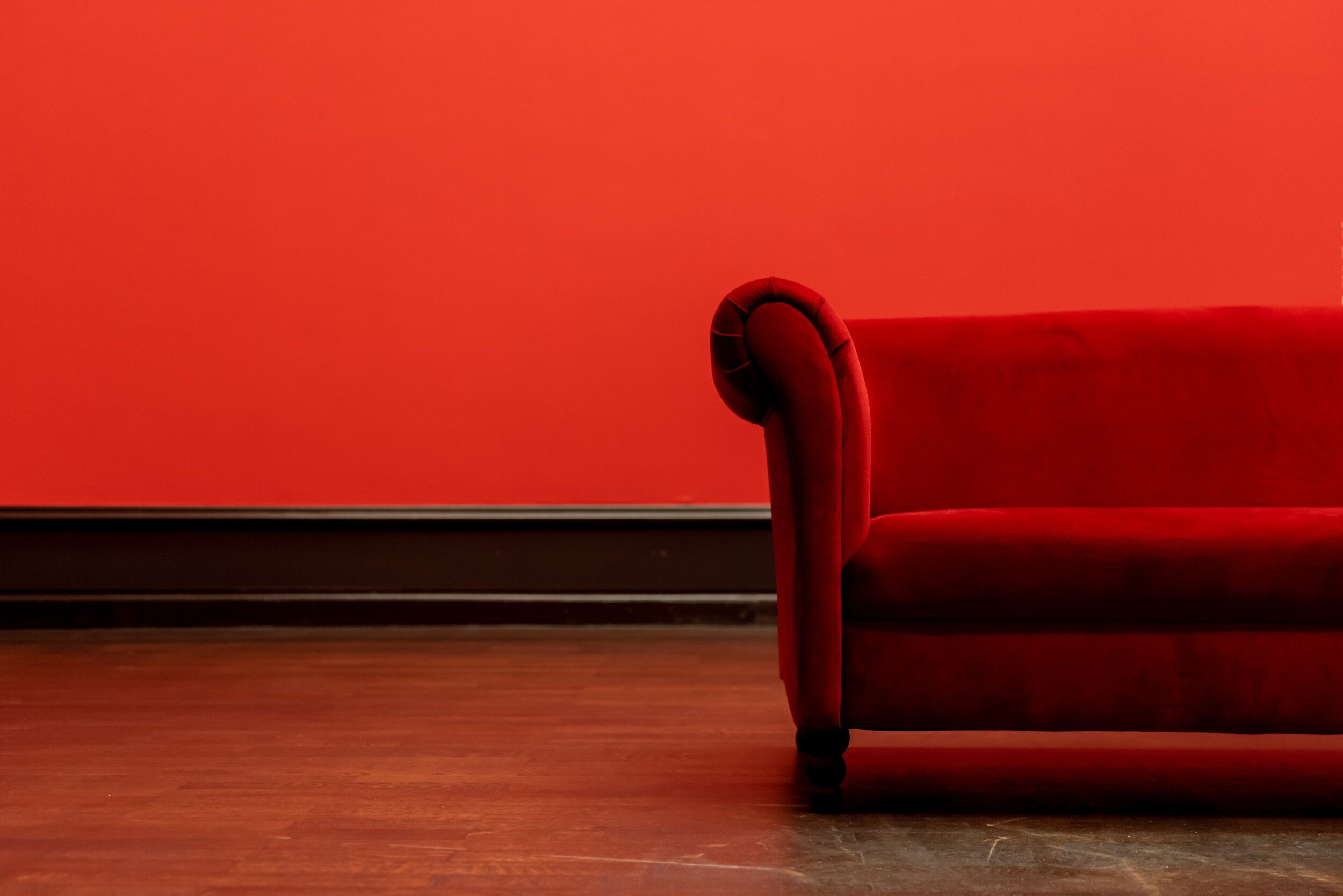
Deep Red
Distinctly darker in tone, deep reds make for an appealing paint trend for spring/summer this year as our interior designers and clients alike are finding themselves uninspired by the now all too common makeup-inspired paint colors as of late.
Deep red tones are great for offsetting the lighter and brighter hues we often see in spring and summer and they make for a welcome change compared to the otherwise standard paint trends for spring. They’re luxurious and full of personality and look great teamed with lighter shades, neutrals, and dark and visually heavy colors as well.
Powdery Pink
We never tire of seeing blush tones and where better for them than spring paint trends? The great think about a powdery pink is that it’s incredibly flexible and soothing at the same time, which makes it work in pretty much any space, with any style or color of furniture.
And the lighter pink you go, the more gender-neutral and timeless of an addition it will feel while making your spring renovation a much easier than it might have been. A soft, warm, and relaxing color, this rosy shade is pretty and gentle, but still looks great when juxtaposed with even the most masculine of elements.
Vivid Greens
Vivid greens are bright, bold, and full of zesty energy. But compared to the intensity of the other color paint trends for spring and summer 2019, they’re much for versatile for color pairings.
Plus they’ll highlight the decorative items you bring in brilliantly, especially high-shine metallics and vivid artworks. It’s a color range that boasts plenty of refreshing attitude and they will leave any room feeling full of energy. Team them with light and neutral furniture to offset their personality and to avoid a heavy-handed feel.
Luxuriant Toffee
Toffee shades are a warm and wonderful to add extra depth in a room, and they look great just about anywhere. Like with warm reds as well as lighter neutrals and even bolder colors like navy blue and black wall paint.
Toffee shades are soft, supple, versatile, and timeless. And best of all, they’ll add their own element of elegance to your home renovations, making them a firm favorite of our take on the best paint trends for spring 2019.
Buttery White
When it comes to neutral paint colors, bright whites seem to have taken a back seat for now. Instead of the clinical feel ultra-white paint tends to give off, warmer and more comforting buttery whites and creams are more viable neutral paint trends for spring/summer.
They work well when paired with some of the more intense hues on this list as an anchor color. But they are also versatile enough to work perfectly alongside calmer trending pastel shades. Since it’s a delicate color, when teamed with more vibrant hues and calmer ones alike, it will really sing. And the same goes for patterns and prints of all kinds since you can never go wrong with a timeless, neutral foundation in any room.
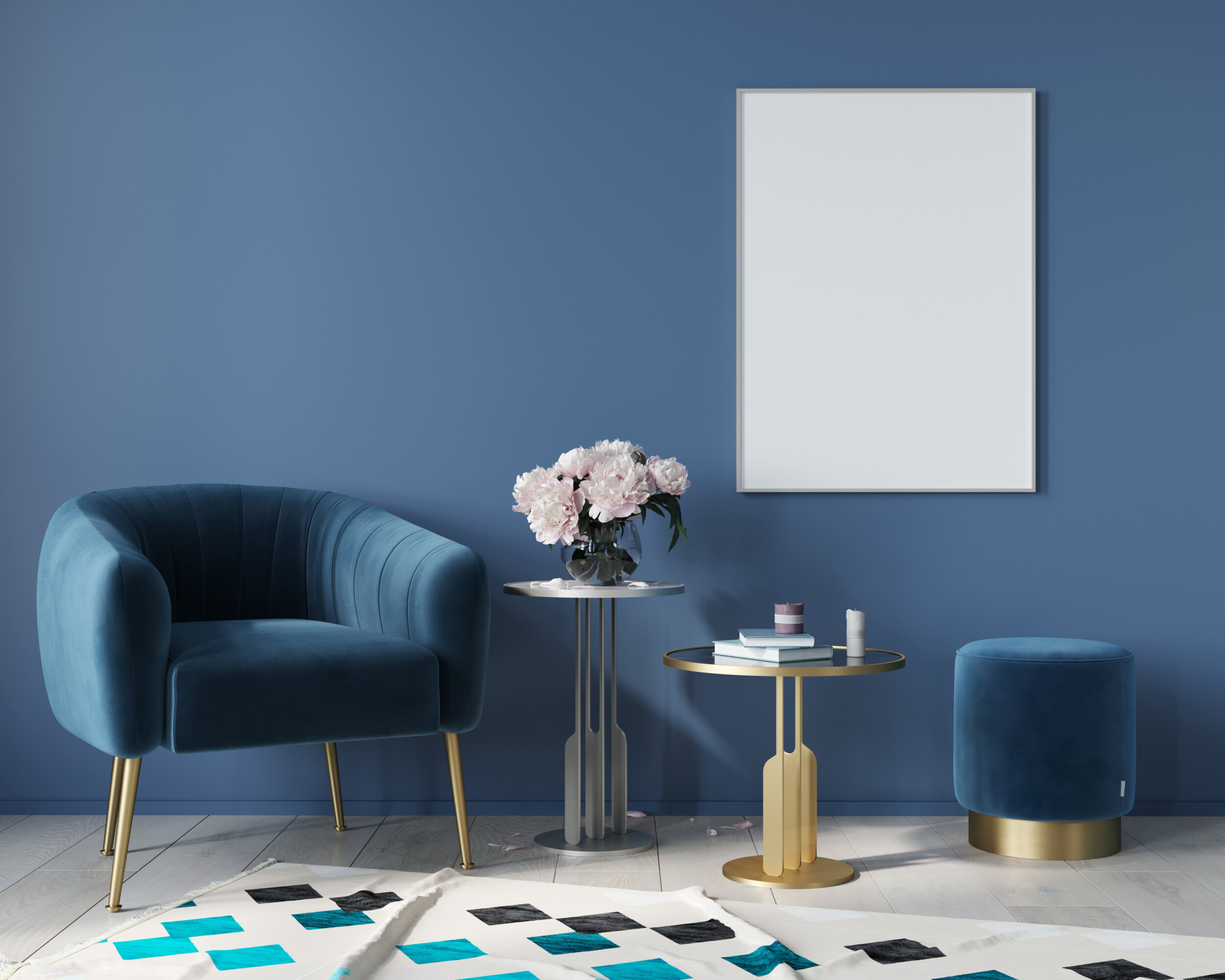
Royal Blue
Royal blue might not be a color you would expect to see on a list of paint trends for spring and summer, but our interior designer made a convincing case on introducing this preppy hue into your home this season.
It’s a strong and cool color at the same time, but it comes into its own when its paired with some of the other top paint trends for summer and spring this year. Vibrant mango shades will set the tone of royal blue off like nothing else, as do warmer yet soothing toffee shades and more energetic ones like chartreuse.